Headline Deadline
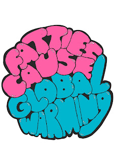
This is my final design that i submitted for the headline brief. I chose this colour scheme as i thought this was the best choice that both represented the theme of the headline and the best colour scheme that would appeal to Urban Outfitters audience. I used an old school bubble style hand drawn typeface that i thought was appropriate for the word "fatties" and so i used it for the whole text, to create consistancy. I placed all the typography loosely in a circle to represent the earth, for the "global warming" aspect of the headline and decided on a black outline/background to make the hand drawn typography stand out and enhance that old school 80's colour palette.


Labels:
final piece,
Headline,
OUGD301
