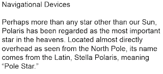
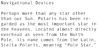
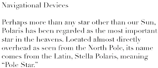
I wanted a typeface that had a slight nautical feel without using a decorative/flamboyant font. I decided to use Didot for the front cover typography as I thought it had a nice old fashioned feel to it and I used Gill Sans for the body copy and titles of each navigational device as I thought it represented the clean, clear typography needed to be easily understood when looking for directions.


Didot -

