Showing posts with label initial ideas. Show all posts

Tea Towel Brief - Start to Finish

This post is the whole brief as I did it in a day, so I thought it was fitting to have it all in one post! (you can see my previous work for this brief here and here,which was used as a starting point for ideas and concepts for what is in this post. The previous posts about my tea brief and the work in this post are the same brief, I just changed the time restrictions and deliverables - all images can be clicked to see them larger)

Research -
As my design was to be appropriate for the website ToDryFor.com and their audience, I looked at the existing designs available on their website, and chose what I thought, were the most interesting designs or designs that were similar to what I had in mind of creating.


Experimentation -
I wanted to create a more hand rendered image for my final design and I felt that the only way to do this would be to actually create my imagery by hand, not computer. I wanted to focus on the phrase "Honey & Lemon" from my previous ideas for this brief and adapt this phrase to fit this design. I used an actual lemon dipped in ink to create the shapes and patterns below as i thought this would give a great textured, hand made effect to my design which would appeal to my audience. I used a black ink on white paper so when I scanned the prints in, I could edit and utilise them easier, by live tracing and changing the colour in illustrator.


I then wanted to create a dripping, runny typeface for the word honey, to represent its qualities and I thought the best and most interesting way to do this would be to use real honey. I had a squeezy tub and used it as a fat pen to write the word honey. Below are the photographs I took to use. Again I used a white background as it would make things easier when it came to digitising the typography.


Below is the digitised typography. To digitise the typography I opened the files in Photoshop and deleted the white background, then copied the type into Illustrator to live trace and play with the colour.
Development
Below you can see my development playing around with typefaces, colour ways and textures (scanned wrinkled paper in the first image)


Final Design
For my final design I decided to mock up my towel design in the format used by the ToDryFor website. I did this by taking screen shots of the website homepage and adding my designs where other design were. I also added a description to fit my tea towel's theme of honey and lemon that is to the right of the image (click image for a better look)


Fairytale Booklet - Initial Illustrations

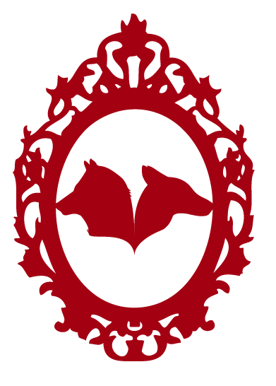
These are the initial illustrations I have created for the first story, "The Wolf and the Seven Little Kids" During my tutorial with Justin, we discussed how I can make my book of a higher and better quality than the guardian booklet as well as making it different to the booklet I am using for inspiration.

I have decided to create silhouettes using a deep red (taking inspiration from the colouring of a Fox) to create a striking impact and will use black for the text(taking inspiration from a Wolf and its an obvious, easily legible colour) and a cream coloured stock to set of the deep red and give the book a more vintage, old fashioned feel of aged paper. Below are the initial illustrations:

Front Cover Design 1 -


Front Cover Design 2 -


Thumbnail illustration -


Title Page for the single story -


Full Page illustration about the story -

Fairytale Booklet - Initial Ideas

These are my initial ideas for my illustrations to be used for my fairy tale book. I have tried to keep them simple and only have the simplest details to give the basic shape of the subject as this is how I would create a silhouette.


ISTD - Zine Theme

As a theme for my zine i have started looking at ephemera and as i have a collection of old maps, i would like to use these as a main theme that runs through the zine. I will utilise the maps as imagery for topics of articles and use maps and collecting as the main themes of my zine. I will use photography, illustration, typography (both digital and hand drawn ) and a limited colour palette.
Below are some interesting examples of the maps i have collected...


Occasions Ideas

I would like to focus my designs on the "empty nest" audience - Middle aged women who's children have left home and so they can afford to spend that little bit extra on something special like buying cards for their female friends occassions (pregnancy, christenings, weddings, moving house, congratulations etc) I think would be a good audience for me to create designs for as i think that my style of creating and taste in colour and design would best suit this audience. I know i wouldn't be know good at designing cards for young boys for example, so i will go with what i know i can produce a quality product for. I would like to use a muted and subtle colour scheme of whites, grays, dusky pinks, creams and pastel colours and would like to use the following processes; blind embossing, laser cut typography, 3d/pop up or raised text, simple elegant fonts, layering and subtlety with use of foiling and/or flitter in a discreet way. Now i have my audience (empty nest), limitations such as colours (subtle and muted whites/grays/pinks etc) and processes (diecut/lasercut/layered/blind embossing 3D text etc), the products i can design for and on (cards, wrapping paper, tags, bags, bows etc) and a tone of voice appropriate to my audience (light-hearted, happy and uplifting) I will create a few mock up designs that i think would be of interest.